COMPONENTS

FURNISHINGS
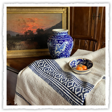
From fabrics to rugs to antiques, there is a wide range of materials available with a connection to early California.
LEARN MORE

STRUCTURAL
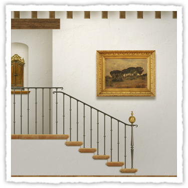
With our library of historic regional architecture, we have the ability to update and detail a home while maintaining it's stylistic origins.
LEARN MORE

GARDENS
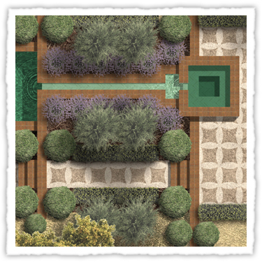
The garden of a Oaks and Olives home is an integral part of the aesthetic.
LEARN MORE
RENDERINGS
Many years ago I found Photoshop to be a useful way to integrate CAD drafting and images of materials to create renderings of spaces. What follows are a number of renderings that express the aesthetic that I am looking to create.
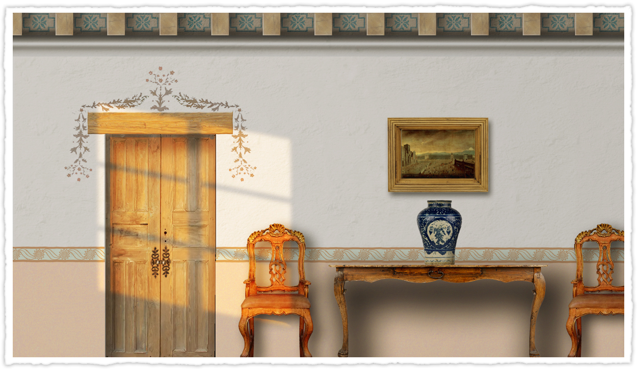
This rendering includes mural motifs from California missions combined with antique Mexican doors, an 18th century table from Mexico, and 18th century chairs from Peru. The curved cabriole leg of both the chairs and table were a common feature of furniture throughout the Spanish Empire well after it was out of style in Continental Europe. The blue and white Talavera pottery shows a motif that was common during the time of early California. The brighter colors and more exuberant graphics of contemporary Mexican ceramics were to come later.
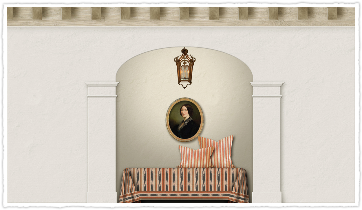
I have a book on architecture and interiors of the Hudson River Valley. In this book is a great interior by the late Frank Faulkner. This rendering is a study based on a small space in that interior. The architecture has been changed from east coast classical to a a regional motif more in line with early California. The bed is covered in hand-woven Guatemalan fabrics.
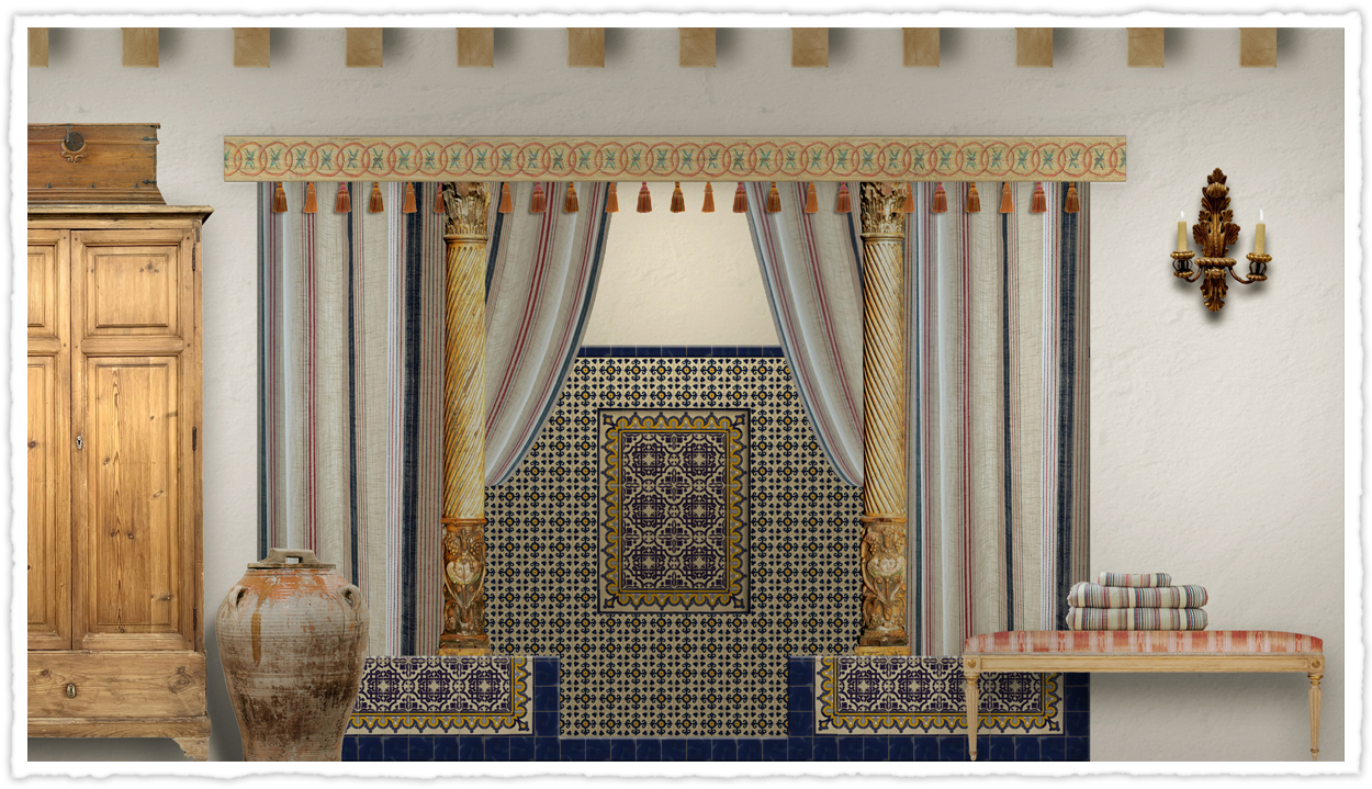
A truly extravagant bath. I have never been a big fan of how we use Talavera tile in Mediterranean houses in Southern California. Often they are used in a timid way; looking like someone has pasted colorful cocktail coasters underneath of their stair treads or a half dozen imbedded in the plaster of the fireplace. I say go big.
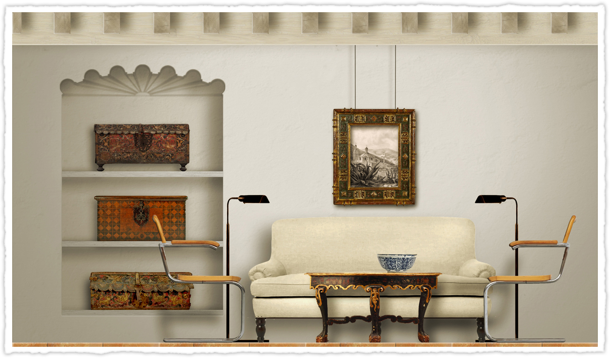
This is an example of combining traditional pieces with modern furnishings. I really like the simple lines of modern furnishings combined with the exuberance of Spanish Baroque. I think combining period architecture and antiques with the occasional contemporary piece makes the place feel more authentic. Sometimes being too period correct can create a sense of forced nostalgia.
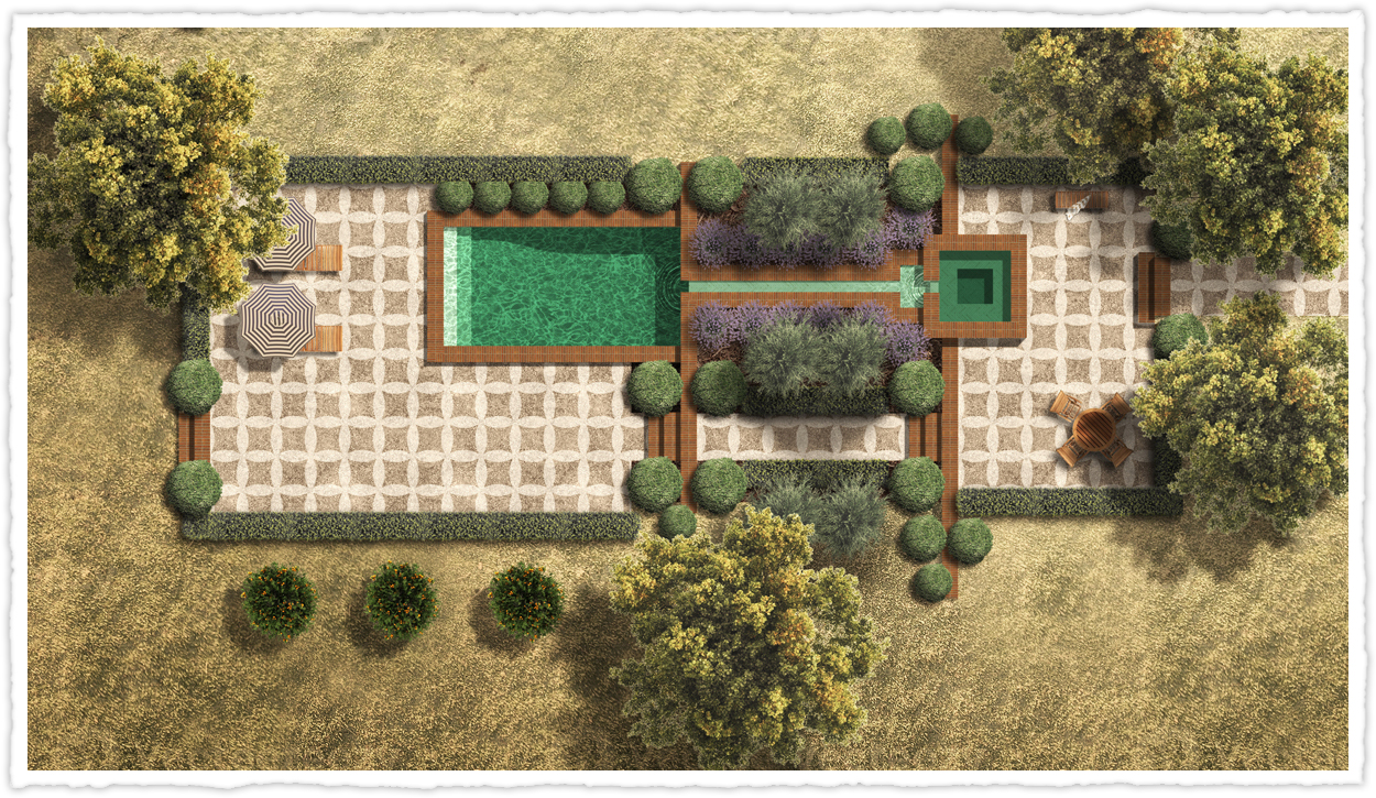
This is a mock-up of a Spanish garden with a tiled pool and spa. Long thin bricks – as were common at the missions - are used for the water feature copings, retaining walls and steps. A traditional Andalusian pattern with interlaced light and dark pebbles is shown for the patios. The water way between the spa and the pool is reminiscent of the brick lined water features of the Alhambra in Granada, Spain. All plantings are appropriate for this climate including California natives and early imports to the region.


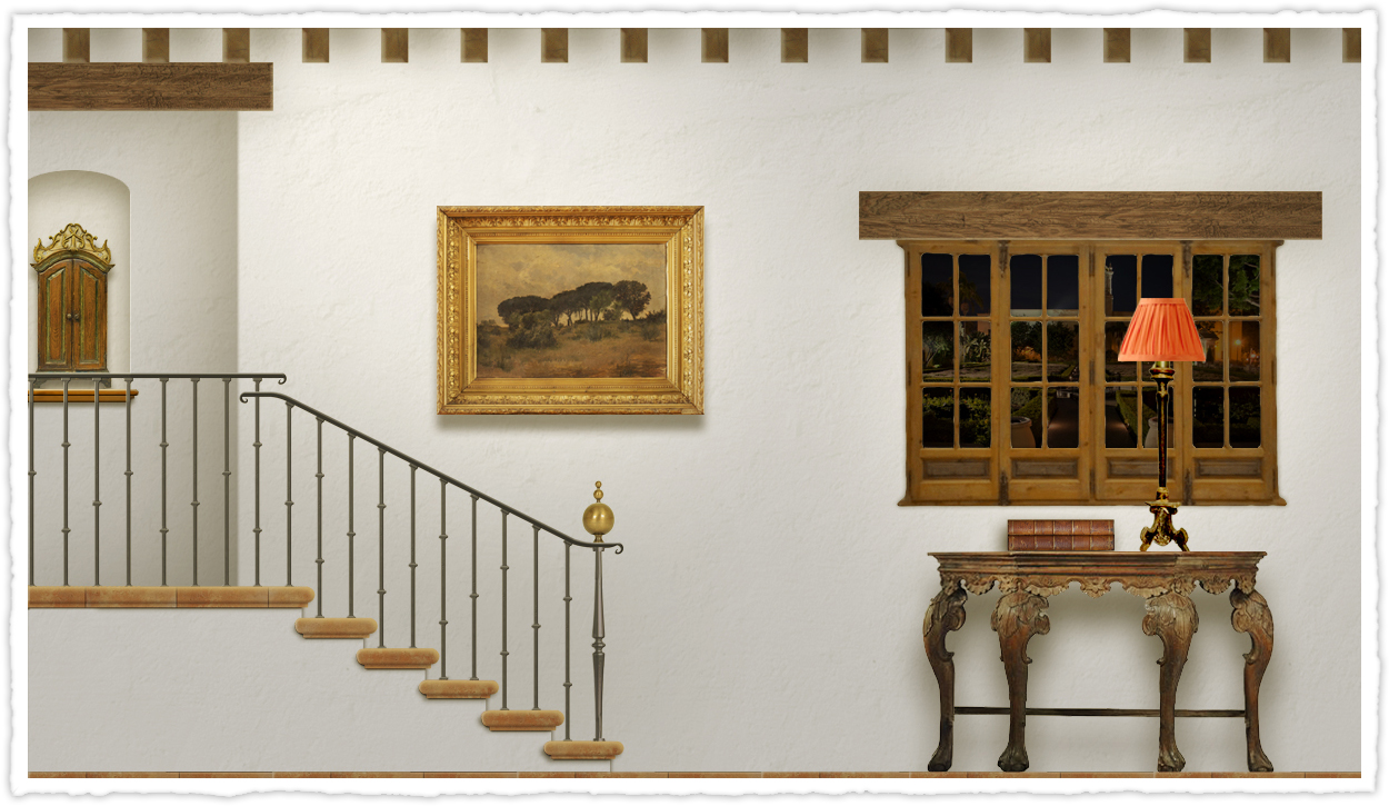
Inspiration for this staircase was taken from 100 year old images of the Casa de la Marquesa de Uluapa. In that case an immense amount of Talavera tile was used to decorate the walls and risers leading to a very busy space. I have chosen just to show the iron bannister and brass spheres in a simpler setting where the railings innate beauty becomes that much more obvious. In early California this would have been rather decadent. Iron had become a rather scarce commodity and its use was most often reserved for items like tools, hinges and latches.


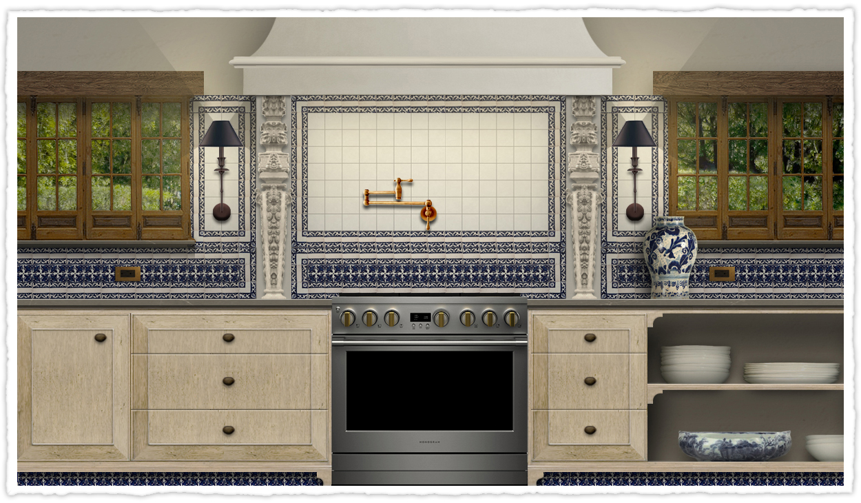
Old Latin American kitchens bare almost no resemblance to contemporary kitchens. A simple image search of Mexican kitchens leads to a lot of pictures of very clichéd spaces. I have tried to create something different here. There was a time when the whole world was mad for blue and white ceramics. Mexico showed this preference through their Talavera tiles. I have shown that here with the back splash. Also include are two estipite columns, a fixture of Latin baroque architecture.
MORE ON HATHEWAY DESIGN
For over twenty years I have worked in interior design and landscaping for both residential and commercial clients. Please see my main website HATHEWAY DESIGN for a sampling of the work I have done over the years.
